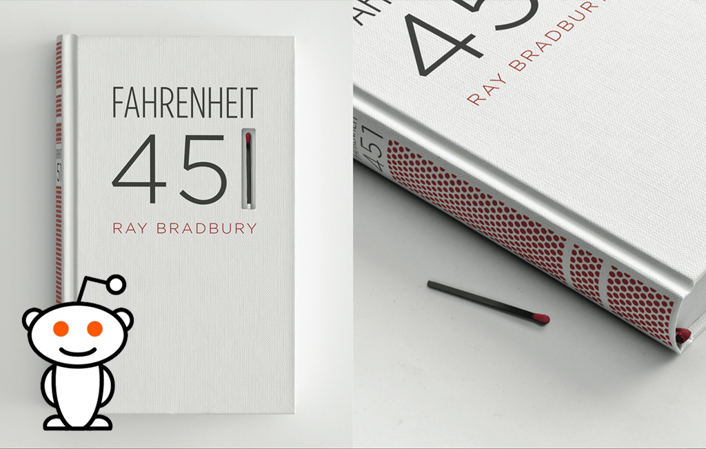
My Fahrenheit 451 book design got insanely popular in a short amount of time. Many of you reading this post now were most likely brought to my site because of it, and I thank you for that. As of writing this post, it's reached over 900,000 views. This site has gotten over 25,000 hits this week alone, and I've been bombarded with hundreds of kind emails asking where the book can be purchased (it's not for sale because it's a concept design). Although I haven't had the time to respond to each email I've received, I've read each and every one of them and loved them all. Thank you to everyone who took the time to write to me.
It's been tremendously inspiring to see something that is not a cat video or a silly GIF get popular online. I'm so proud that something I put my sweat and tears into received so much recognition. This experience has been extremely motivating for me, and I hope I can create more work in the future that is as impactful and inspiring to others.
I made this piece during my time at The Austin Creative Department, and great ad/creativity school in Austin, TX.
Here are just a few of the sites that featured the book design:
The Chicago Tribune, The Huffington Post, BuzzFeed, Reddit, Gizmodo, Gizmodo Japan, imgur, CrackaJack, Mediabistro, Slow Robot, NOTCOT, Laughing Squid, Jessica J. Johnston, IdeaFixa, Flavorwire, Neatorama, and many, many more sites.
Bonus: Out of hundreds of wonderful message I've gotten about the book design and my other work, I only received one negative email. Which is shocking, considering that the internet is a notoriously mean place. Here's that email for your enjoyment!
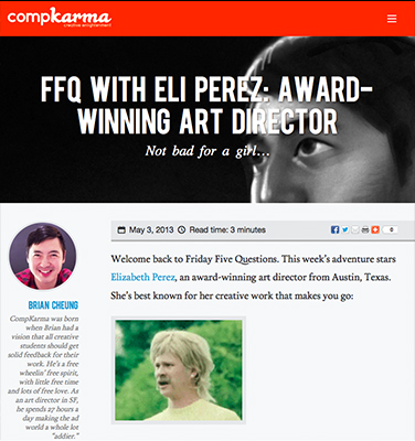 I should've shared this sooner, I was recently interviewed on CompKarma, an awesome blog all about helping newbies break into advertising. I hope you all find the interview informative yet funny. Brian Cheung, founder of CompKarma, was absolutely great chatting with. I drew him a portrait as thanks, which you can find on the interview's page. I recommend checking out the rest of their site, there's a ton of useful information on there written by those working in the ad industry. Their posts are all simple, easy to read, and filled with humor. There's even an article that compares portfolio sites to ninja turtles.
 My
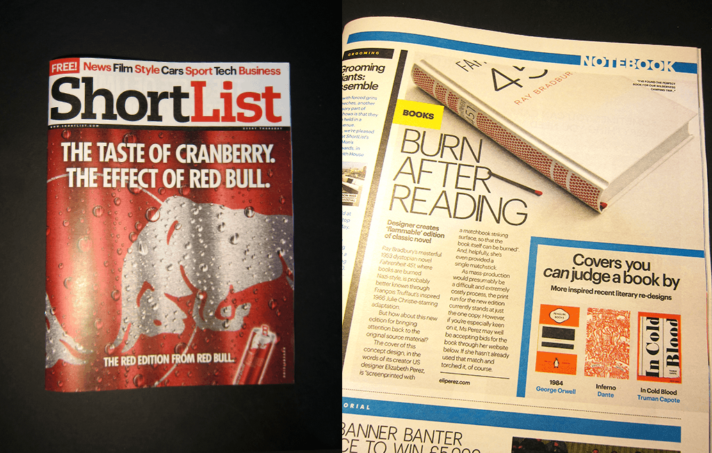
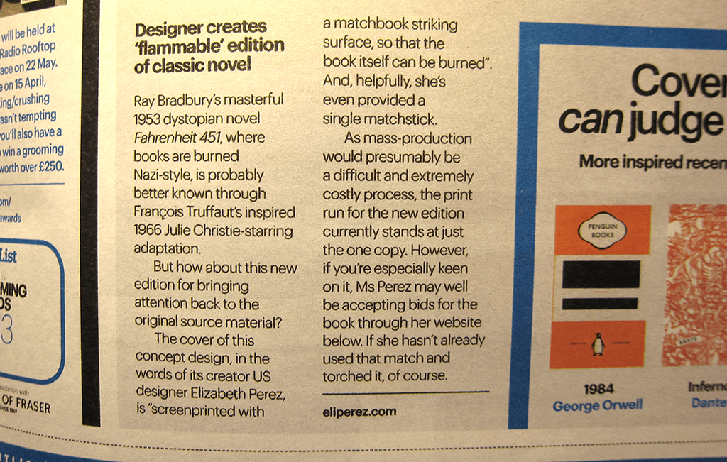
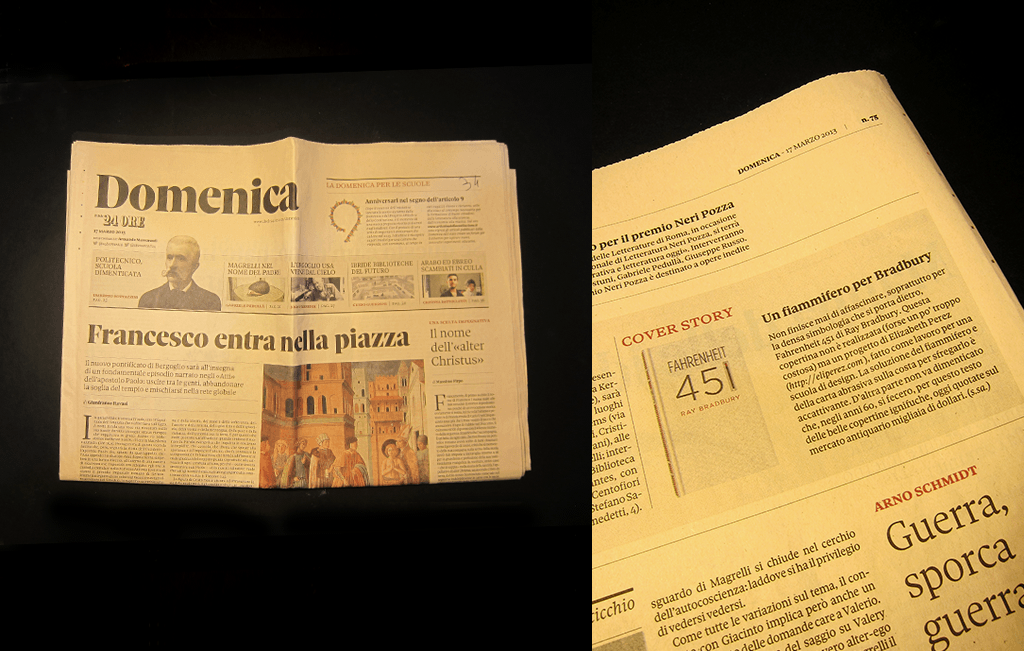
My 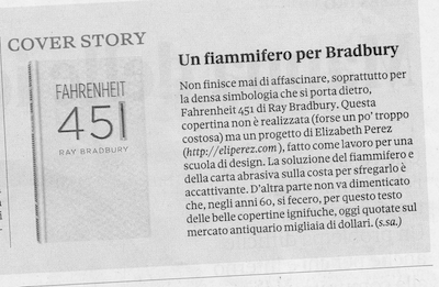 Correct me if I'm wrong, but I believe ganzo translates to cool in Italian! A friendly Italian emailed that my Fahrenheit 451 book design and I were mentioned in an Italian newspaper, Sole24Ore. A big thanks to Francesco for alerting me about this and for willing to send me a copy in the mail! My work was also featured in the Chicago Tribune, but I have no clue when that published... Translation: Fahrenheit 451 never ends to fascinate, mostly because of the thick symbology it has. This cover isn't realized (maybe too much expensive), but it's a project of Elizabeth Perez, made for a design academy. The solution of the match and of the abrasive paper on the flange for rubbing is endearing. On the other hand, it must be remembered that, in the 60s, were made for this book some beautiful fireproof covers, that today are valued on the antiquarian market thousands dollars.
